
Compare boat sticker colours on the fan, then use the ratings for how the vinyl holds in Australian sun. Solid colours last longer than metallics. Contrast still decides whether a name or registration can be read from the water.
Colour Durability Guide
People pick a colour because it looks right on the hull. What they send back is usually fade, a metallic that dulled, or a rego that never had enough contrast. The numbers below are the outdoor ratings we sell to — Standard polymeric and 3M cast — plus how the pigments in this swatch tend to behave in Australian sun. Salt is the easy part. UV is the part that shows.
- Black
- white
- Metallic Silver
- Metallic Gold
- Navy Blue
- Royal Blue
- Blue
- Light Blue
- Yellow
- Orange
- Teal
- Light Green
- Dark Green
- Grey
- Burgundy
- Red
- Boat Stickers Shop Colour Swatch
3M vs Standard vinyl
| Standard polymeric | 3M cast | |
|---|---|---|
| Solid colours, outdoor rating | Up to 5 years | Up to 8 years |
| Metallics (gold, silver) | Up to 3 years | Up to 5 years |
| UV stability | Good for covered / garaged boats | Better — film holds on boats that live outside |
| Saltwater / alkaline wash | Resistant (solvent adhesive) | Resistant (solvent adhesive) |
| Curves, Polycraft, clinker, lapstrake | Workable | Best — thinner, follows the hull |
| Inflatable boats | Not suitable | Not suitable |
Both films handle splash and salt. 3M does not invent extra years for a metallic — there is no metallic cast vinyl in Australia rated past five years outdoors. The longer 8-year figure is for solid colours.
Which colours last longest in the sun
| Colour | UV hold | Saltwater | Notes |
|---|---|---|---|
| Black | Resistant | Best for regos and outlines | |
| White | Resistant | Best fill on dark hulls | |
| Burgundy, Navy, Dark Green, Red | Resistant | Deep pigments hold | |
| Blue, Royal Blue, Grey, Teal | Resistant | Fine for names; grey is weak contrast | |
| Light Blue, Light Green | Resistant | Use with a dark or white outline | |
| Yellow, Orange | Resistant | High-vis, more UV. Better on covered boats | |
| Metallic Gold, Metallic Silver | Resistant | 3 / 5 year rating. Outline them |
Ratings are for the vinyl film, not a promise the chip will look new on year eight. Bright yellows and oranges still dull first inside that window. If the boat sits on a mooring, pick 3M and a solid colour. If it lives under a cover, Standard is enough for most names.

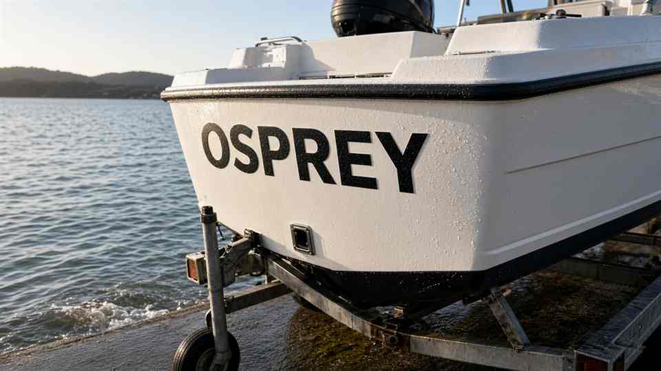
White hull with black boat name 
Navy hull with white boat name 
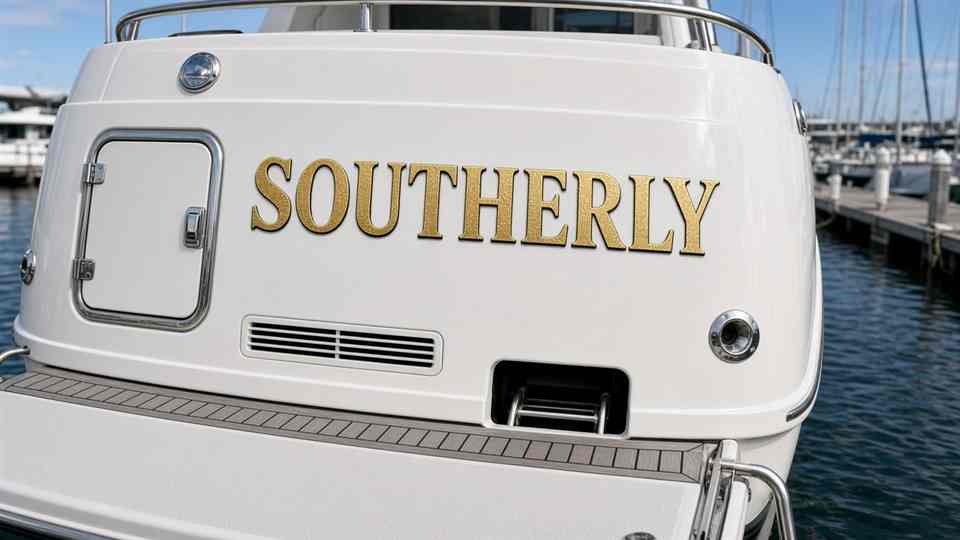
White hull with gold outline boat name 
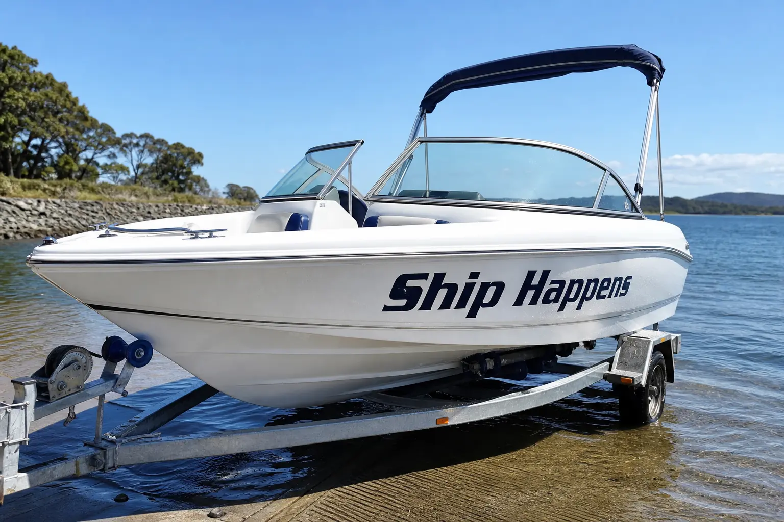
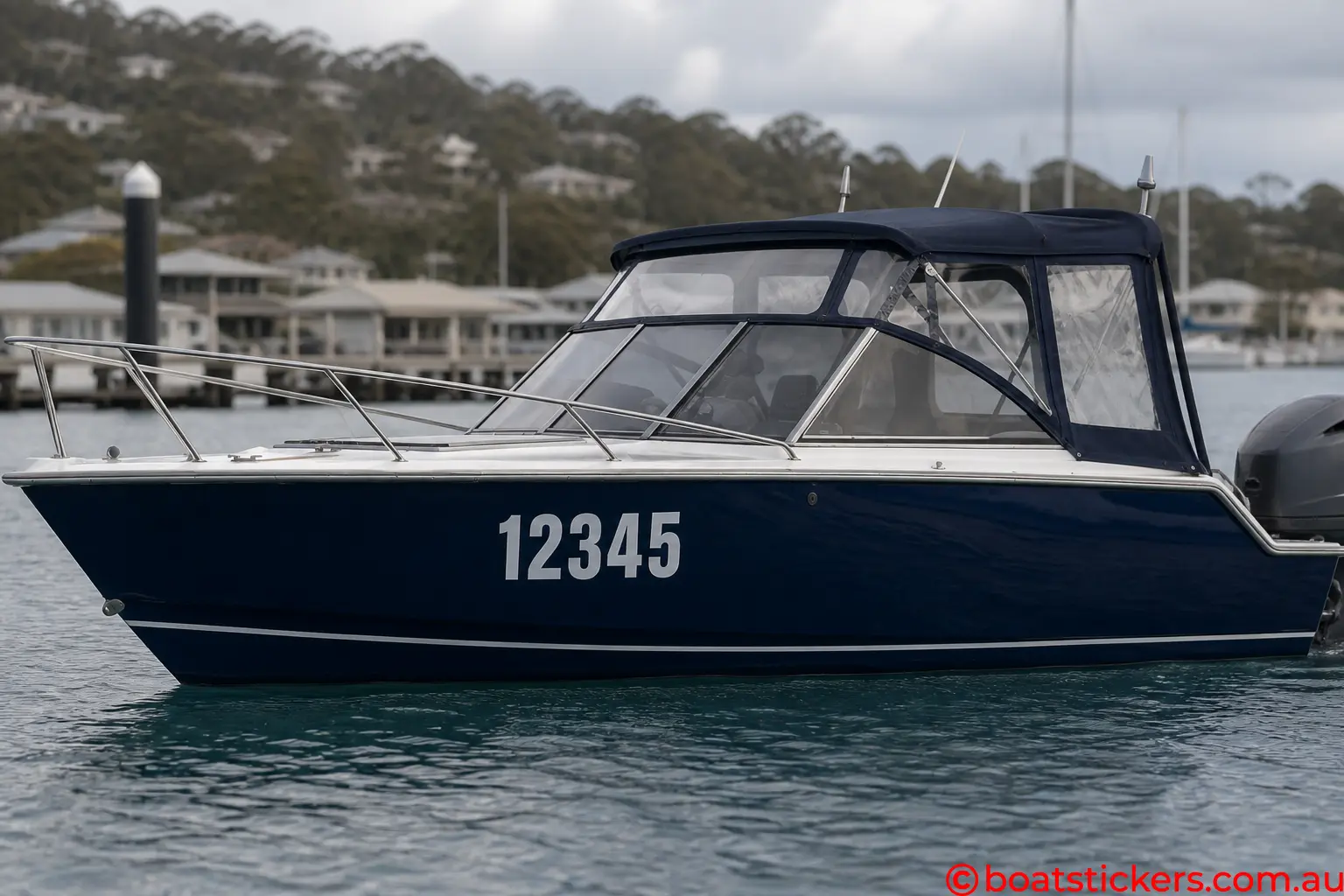
White hull with Ship Happens boat name Navy hull with white registration numbers Cabin cruiser with Dry Dock boat name

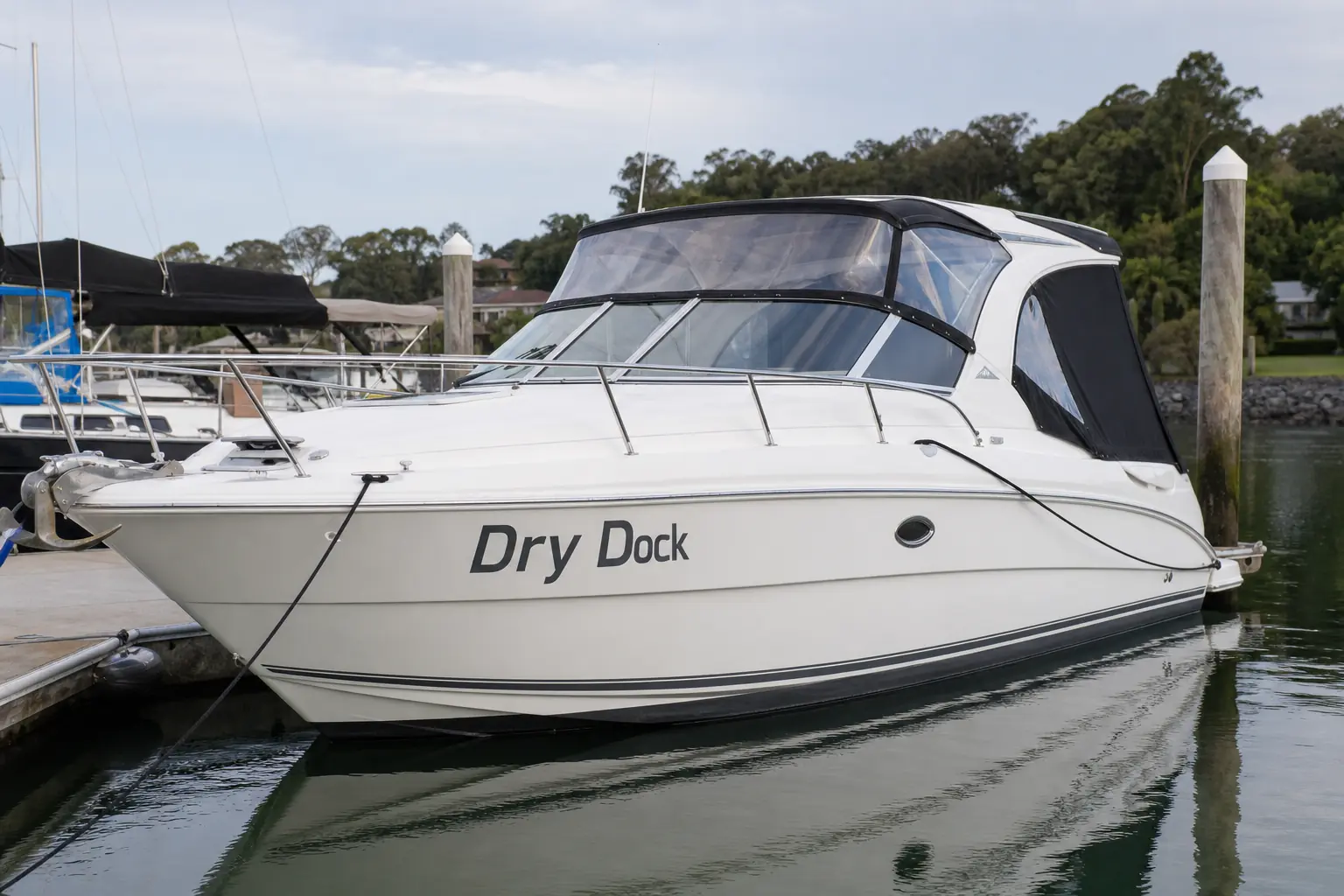
Colour combinations that read on a real hull
These are the combinations that keep working once the boat is in the water, not only in the designer.
Boat sticker colours that actually work
A boat colour looks different in the shed, on the trailer at midday, and sitting on a mooring in February. The vinyl has to survive all three. The chips above are the colours we cut. The guide is how those colours behave — contrast, fade, outlines, and the pairs that still read from 30 metres.
The range is Black, white, Navy Blue, Royal Blue, Blue, Light Blue, Yellow, Orange, Teal, Light Green, Dark Green, Grey, Burgundy, Red, Metallic Silver and Metallic Gold. What you see on a phone is close enough to pick a family. It is not a paint-shop match. Use the fan to compare chips against each other, then pick against the hull you actually have.
Registration numbers: contrast first, favourite colour second
Most states do not name a vinyl brand. They name contrast. NSW wants solid, clear characters that contrast with the hull. Queensland wants them readable from about 30 metres. Victoria, South Australia and Tasmania say the same thing in their own words. Western Australia is stricter: black block digits, not slanted, and a white surround of at least 7 mm if the hull is not white. We keep the state notes on the boat registration compliance page. Confirm the live government page before you cut.
So the best rego colour is the one that still looks like a number when you are off the boat. White on a white gelcoat is a bad idea even if it looks clean in the designer. Black on a black or dark navy hull is the same problem the other way. Grey sits in the middle and fails on a lot of boats. Light blue and teal vanish on pale gelcoat once you put twenty metres of water in between.
Safe rego pairs: black on white, off-white or cream. White on navy, black, dark green or burgundy hulls. Navy, burgundy or dark green on a genuine white hull if you want something other than black. On Western Australia boats the letter colour is already decided — black — so the only colour decision is whether the hull needs that white surround.
Best colour combinations for boat names
Names are allowed to be decorative. They still have to exist in daylight. These are the combinations that keep coming up because they work on real hulls.
White hulls. Black is the classic and it never goes out of date. Navy is the next step if you want it quieter. Burgundy on white reads as a proper name, not a toy. Red on white is the sporty one — fine on a runabout, a bit loud on a cruiser unless that is the point. Gold or silver on white needs a dark outline or a shadow. Without it, metallic flake on a bright hull washes out at the ramp.
Dark hulls — navy, black, dark green. White is the honest fill colour. Silver works if you want metal without shouting. Gold on a dark hull is the yacht look; give it a black or burgundy outline so the serifs do not fall apart at a distance. Red on a dark hull only works with a white or gold outline. Skip light green and light blue as a fill on dark gelcoat unless you are adding a heavy white outline. They go muddy.
Blue hulls. White or black, depending how dark the blue is. Navy letters on a royal or mid-blue hull is a contrast trap — it looks related, which is the problem. If you want blue on blue, use white as the fill and navy as the outline, or the other way around. Teal as a name colour is better on white or pale grey hulls than on another blue.
Grey hulls. Black still works. White can look washed if the grey is pale. Navy or burgundy is usually cleaner than another grey. Avoid light green; it reads as faded.
Two-tone hulls. Pick the panel the letters actually sit on, not the pretty bit amidships. Registration numbers live forward, above the waterline, clear of rub rails. A name on the transom might sit on a different colour entirely. If the letter crosses a colour break, use an outline in the opposite colour so the word does not change identity halfway through.
Outline and shadow pairs that behave. White fill / black outline. Black fill / white outline. Gold fill / black outline. Silver fill / navy or black outline. Red fill / white outline. Burgundy fill / gold or white outline. Yellow or orange / navy or black outline. Those are extra sheets of vinyl, not a printed stroke. Printed edges die in about four years because the ink sits on the surface. Solid vinyl does not. How the layers are packed is on the shadow and outline page.
What the vinyl is doing
We cut solid coloured film. The colour is in the vinyl, not a print on top. That is why a black letter is still black when the sun has had a go at it, and why we do not sell printed boat names and regos. The product guide has the Standard and 3M ratings in one list.
Gloss lies a bit. A gloss red at midday is louder than the same red in the shed. The chip on this page sits on a white background. On gelcoat the neighbour colour creeps in around the edge of the letter. That is also why Navy, Royal and the mid Blue look obviously different on the fan and turn into “just blue” on a small thumbnail. Navy is the one that still reads as navy from 30 metres.
If it is a registration number, pick the highest contrast you can live with, then stop decorating. If it is a name, pick the fill for the hull colour, then decide whether it needs an outline. If the boat lives outside, prefer 3M and a solid colour over a metallic. If you are matching an old stripe, a daylight photo of the hull is worth more than a colour name typed from memory.